People found it on their own
With no teaching UI, readers still discovered Ask Copilot in the selection menu.
I led the evolution of text selection in Outlook from a lightweight Copilot on-ramp into a scaled reading-assistance experience. Across successive experiments, I partnered with engineering and data science to move through multiple design iterations, using real user behavior to drive data-backed decisions. The resulting experience reached approximately 710K weekly users across endpoints, showing how disciplined experimentation can turn an ambiguous interaction into a durable product capability.
Role: Lead product designer
Themes: Product strategy, experimentation, reading UX, AI interaction design, data-informed decision-making, cross-functional leadership
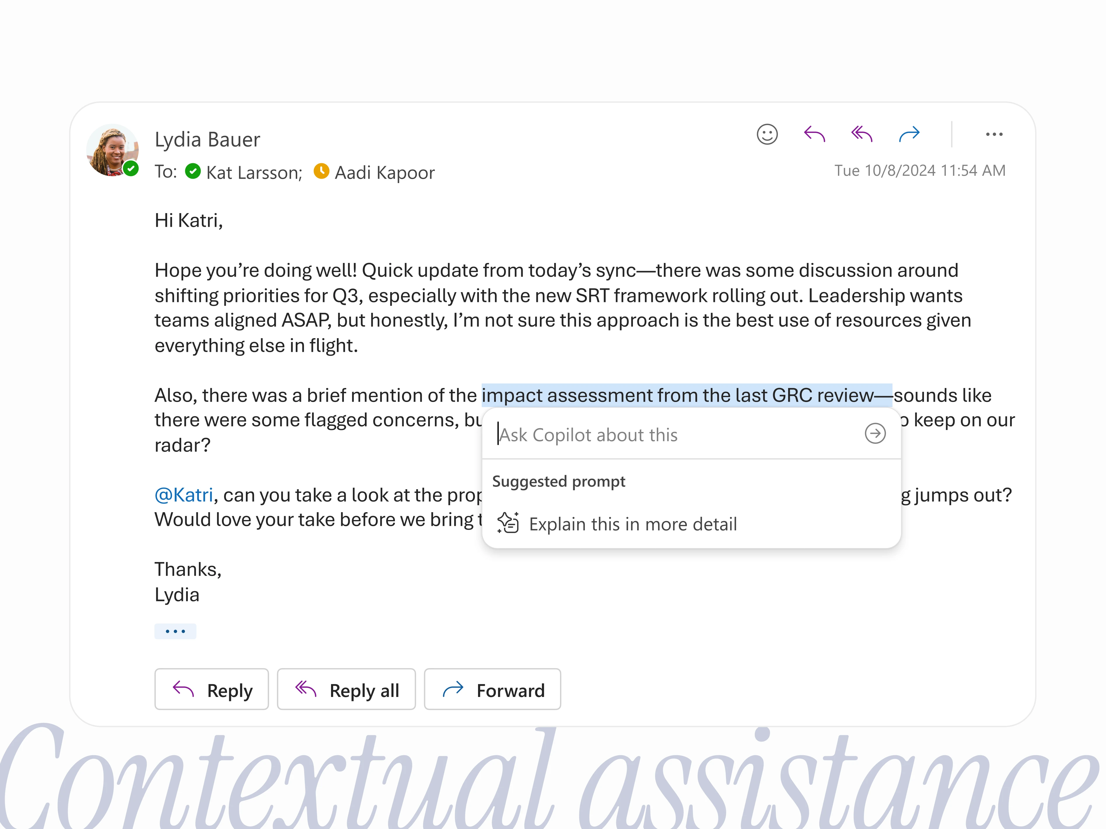
Can selecting text become a natural way to ask Copilot for help while reading? I helped take that early concept into production experiments, then used real user behavior to decide what the interaction should become.
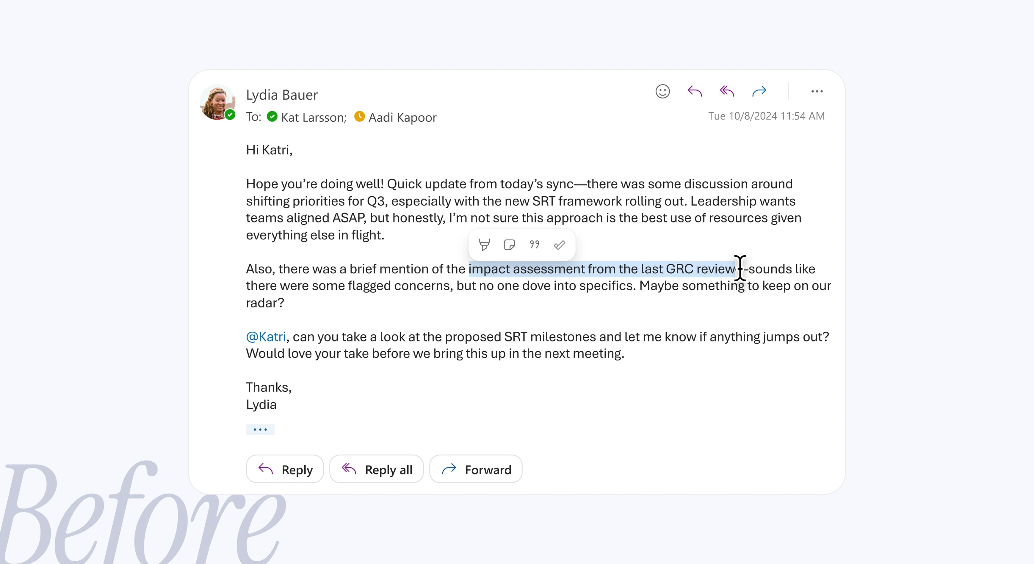
Our first version was deliberately simple. Selecting text in an email added an Ask Copilot button to the selection menu, and one click opened Copilot Chat with a pre-written prompt.
With no teaching UI, readers still discovered Ask Copilot in the selection menu.
For a lightweight entry point, it sent a meaningful share of people into Copilot Chat.
Every click sent the same canned prompt to chat. People couldn’t choose what happened, and it often missed what they expected.
The next hypothesis centered around giving people choice. Selecting text opened a mini prompt where they could accept a suggested prompt or ask their own question.* We expected more control to drive stronger engagement. Instead, we learned that flexibility doesn’t automatically create value.
*Fun fact: This started as a hackathon project and ended up shipping to production, so we could learn from real user behavior at scale!
More control didn’t meaningfully change how much people used it or how often they came back.
Most people who opened the mini prompt left without getting anything from it. The open-ended choice added friction.
Of those who stayed, half typed their own question and half picked the suggested prompt.
Instead of asking people to interpret an abstract Copilot button, the final version named the outcome up front. With Explain this, people knew what they’d get before they clicked. For me, the key lesson was that clear expectations often matter more than offering more options.
Weekly users grew from about 20K to 710K across endpoints in roughly a year.
A relatively healthy rate, though overall thumbs feedback volume was low.
We keep watching usage and feedback to refine the experience.
Text selection was never going to be our biggest engagement driver. It’s inherently less discoverable, but that also made it a valuable space to experiment.
Across each iteration, I formed a hypothesis, shipped it, studied how people actually behaved, and used those signals to decide what came next. Sometimes the data validated the direction. Other times, it told us to simplify or rethink it entirely.
That process reinforced something I now bring to every project: experimentation isn’t about proving an idea right. It’s about learning quickly enough to build the right thing.