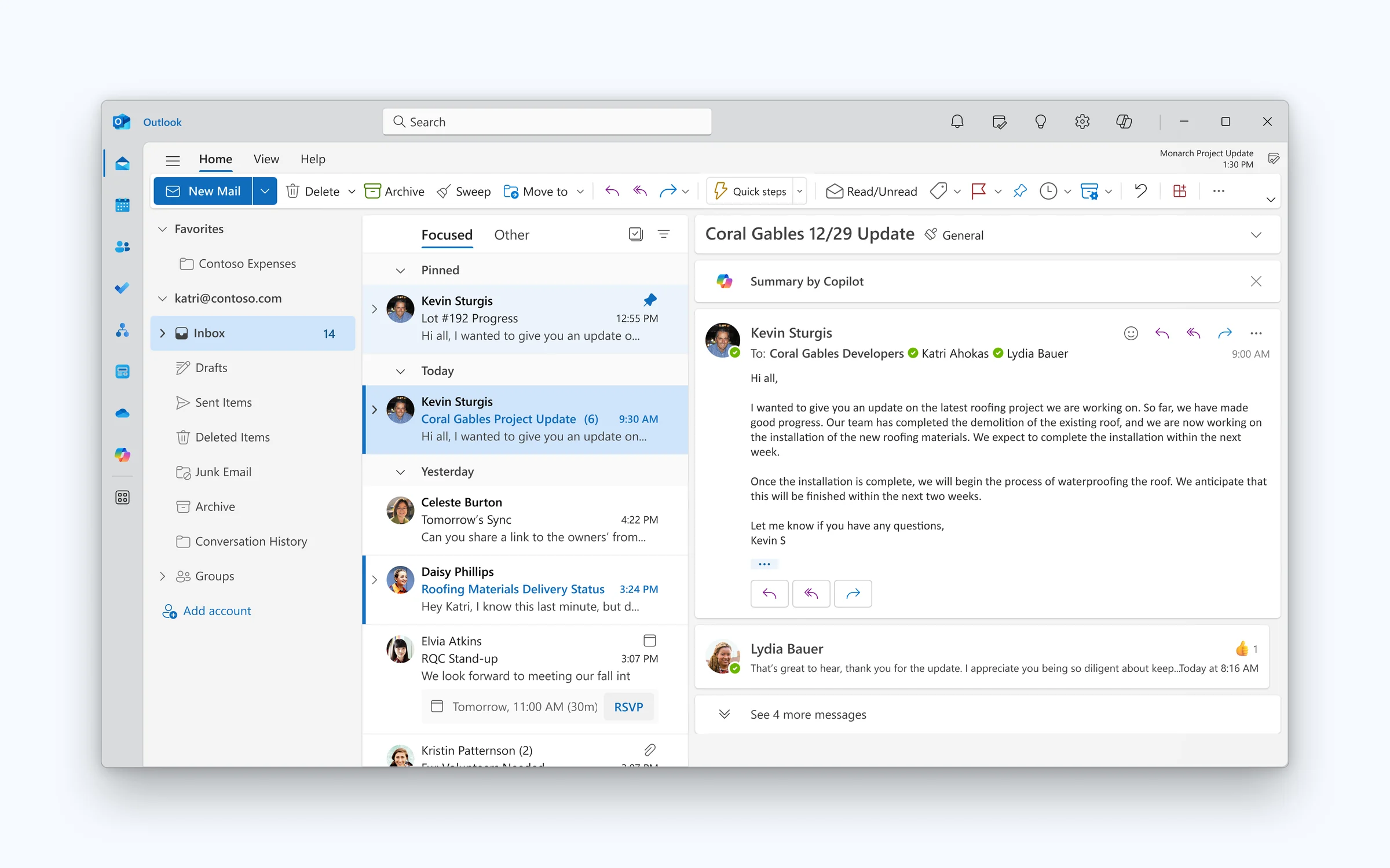
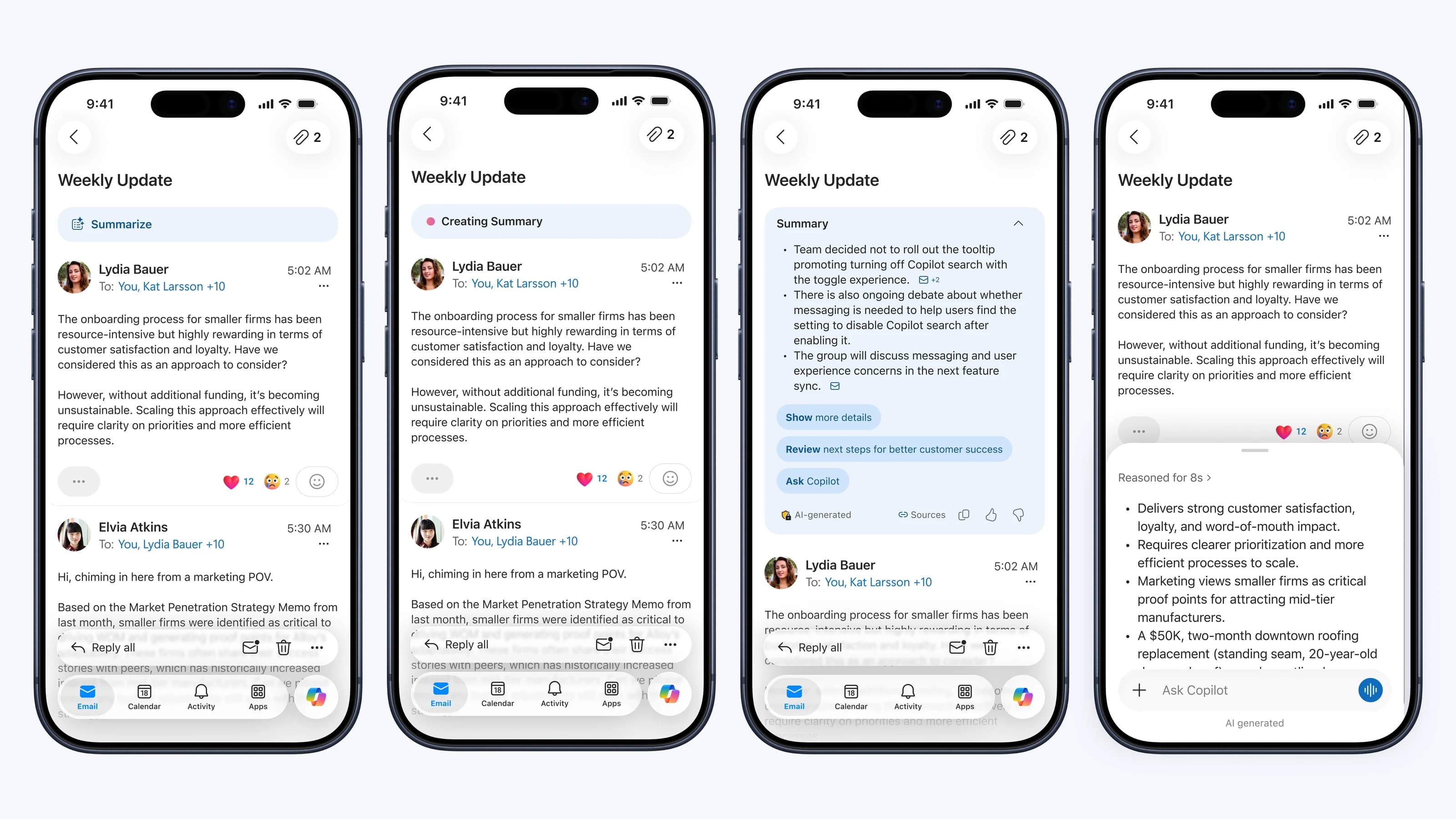
Before generating. A Summary by Copilot bar sits at the top of the email, one click away.
What started as an effort to recover a 40% engagement loss in Summarize became Outlook’s broader strategy for bringing Copilot back onto the canvas. I led the creation of the Copilot Card Framework, a reusable AI system that scaled from a single reading scenario into a cross-endpoint foundation for search, reading, inbox, and proactive experiences, while pioneering agentic coding workflows to rapidly prototype and align teams around the future of contextual AI in Outlook.
Role: Lead product designer
Themes: Systems design, AI interaction design, prototyping, product strategy, cross-org alignment, multi-platform execution
In mid-2025, Microsoft leadership pushed a chat-forward Copilot strategy with a clear mandate: drive as much chat engagement as possible. The shift also addressed a real problem, since a well-intentioned on-canvas strategy (see Starting native and in-flow in the Copilot Chat in Outlook case study) had left Outlook littered with Copilot entry points. Like many teams across Microsoft, Outlook re-centered AI around chat as the primary entry point and pared back on-canvas UX. Through the Chat Forward initiative, Search, Reading, Compose, and Inbox were reimagined as chat‑first workflows, and Summarize moved off the canvas into the Copilot side pane. The bet was that concentrating interactions in chat would make Copilot feel consistent across Microsoft.
Before generating. A Summary by Copilot bar sits at the top of the email, one click away.
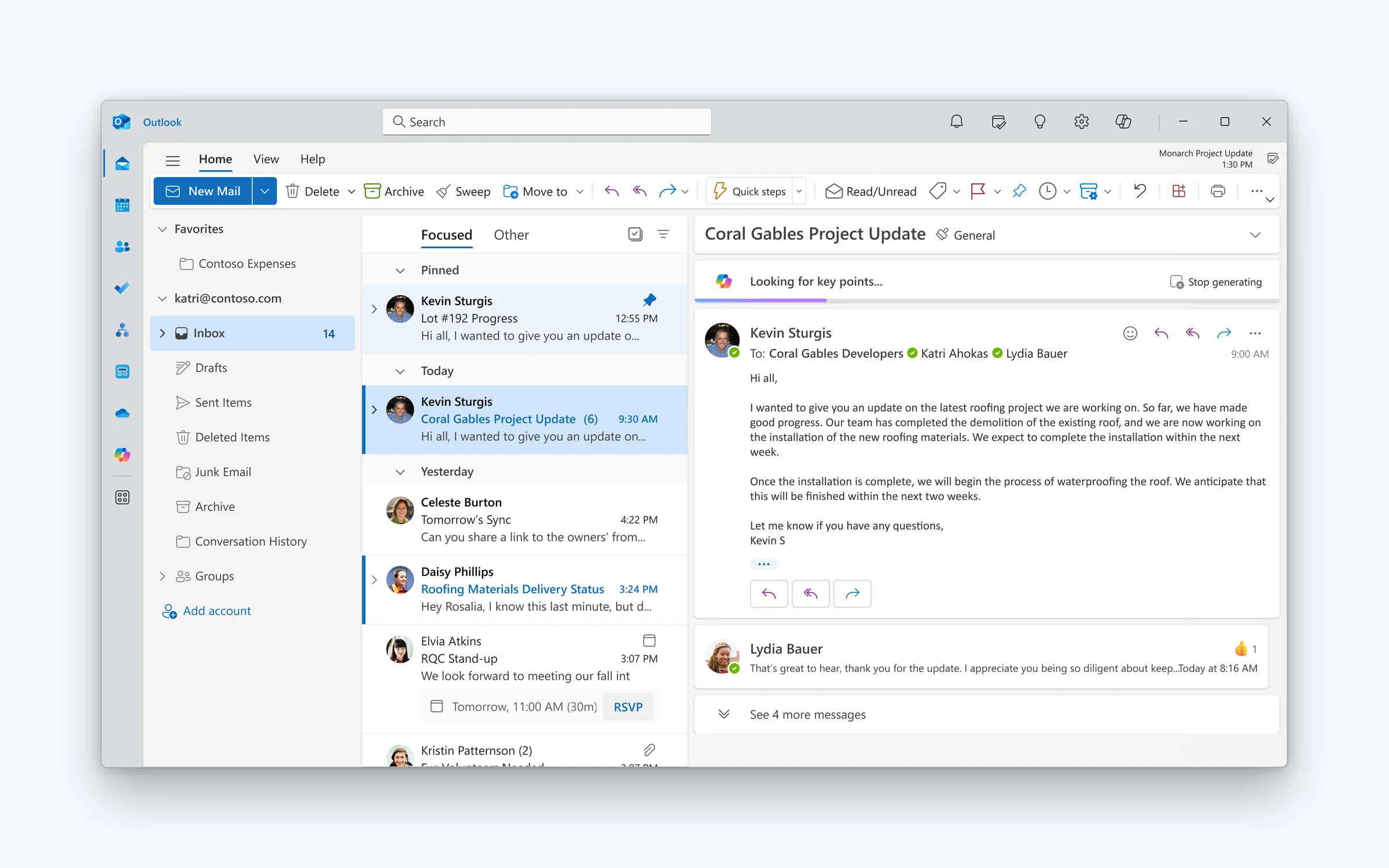
Generating. Copilot looks for key points right above the thread, with an option to stop.
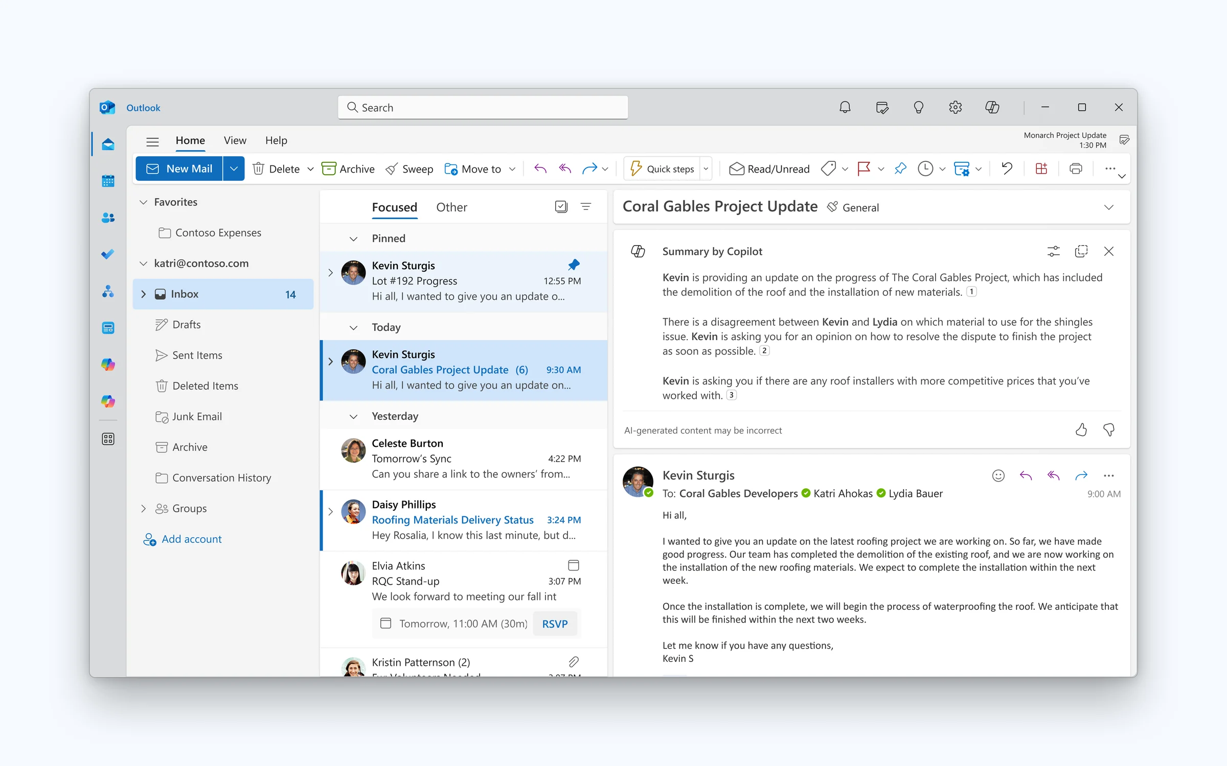
Summary ready. The summary expands in place on the email, with numbered references back to the thread.
Before generating. A Summary by Copilot bar sits at the top of the email, one click away.
Generating. Copilot looks for key points right above the thread, with an option to stop.
Summary ready. The summary expands in place on the email, with numbered references back to the thread.
We dug into how people were using Summarize in chat. The answers weren’t the problem. The experience was. People didn’t want to leave what they were doing to get help, and that reframed the whole project.
Active users reached for Summarize far less once it left the email for the side pane.
They closed the side pane mid-response and never saw the summary they asked for.
Their request never even went through. The pane was still blank when they left.
The team’s obvious fix was to put Summarize back on the email as it was. But that experience was a dead end: once the summary appeared, there was nowhere to go next. Instead of reverting, I asked a broader question. Could we give people a better path into chat when they wanted to go deeper? That led me to reframe Summarize as a reusable container for AI responses, one that could serve many scenarios beyond summaries. It became the Card Framework.
What happened next was unexpected and rewarding. Without being asked, other teams began adapting the Card Framework to their own scenarios, starting on mobile and spreading across endpoints.
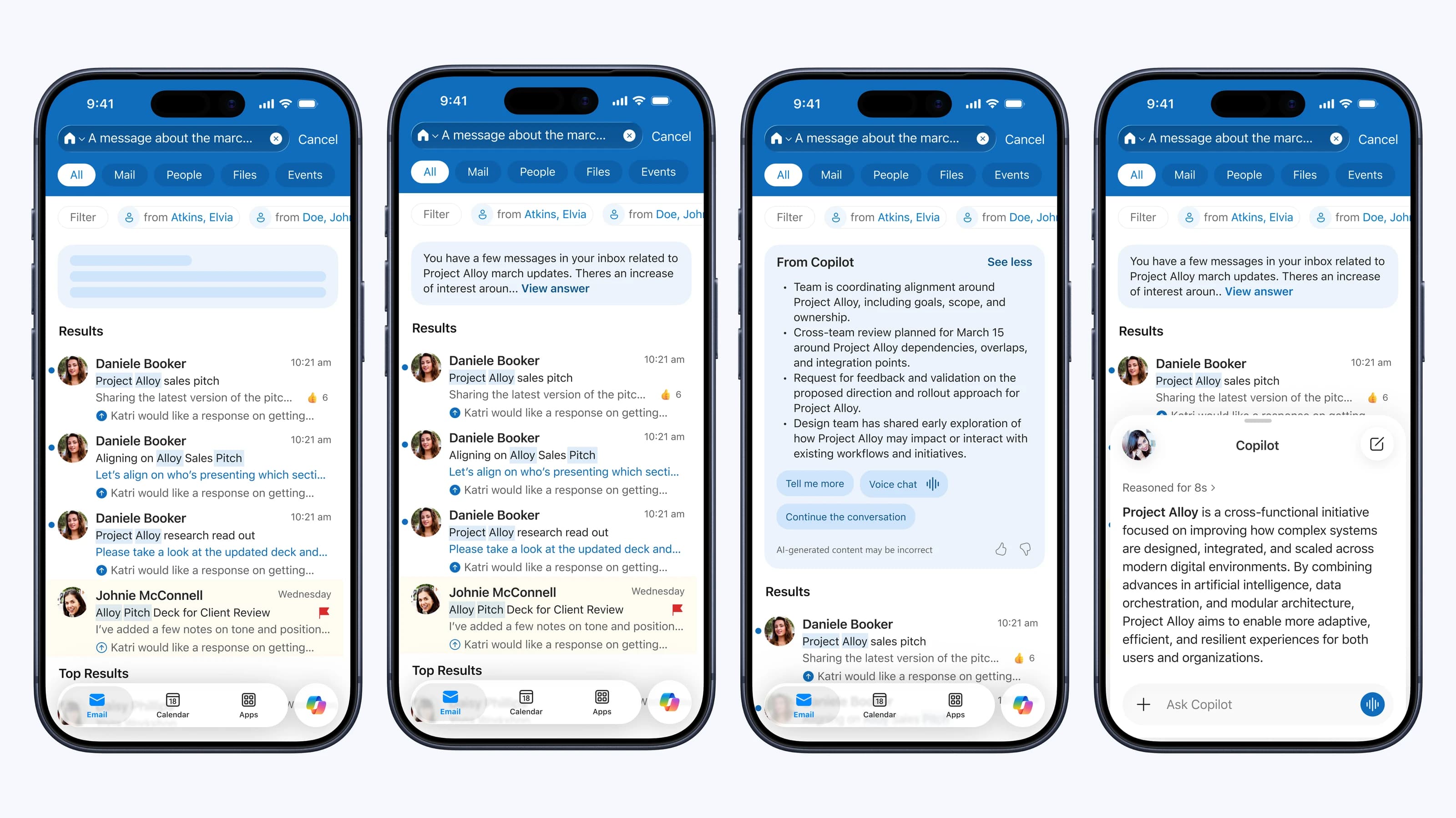
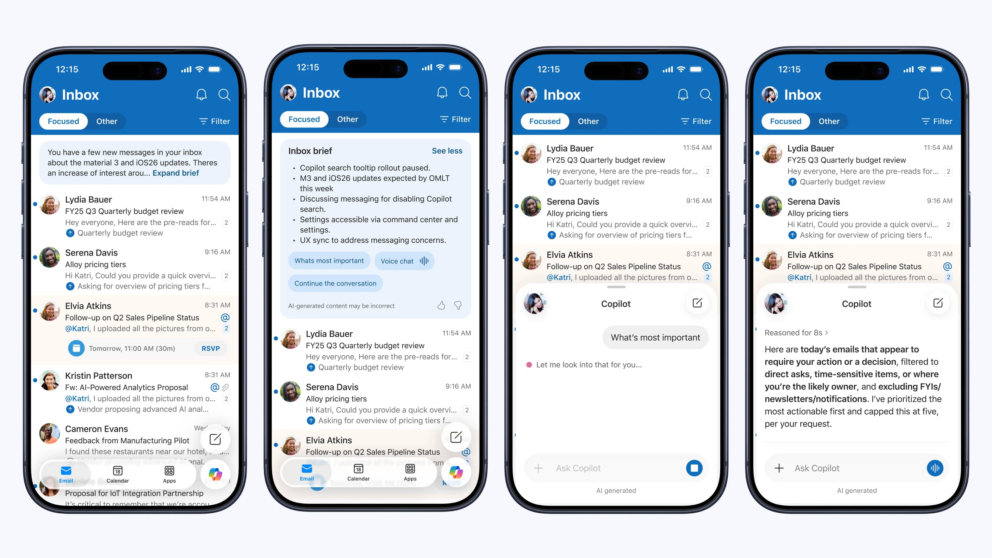
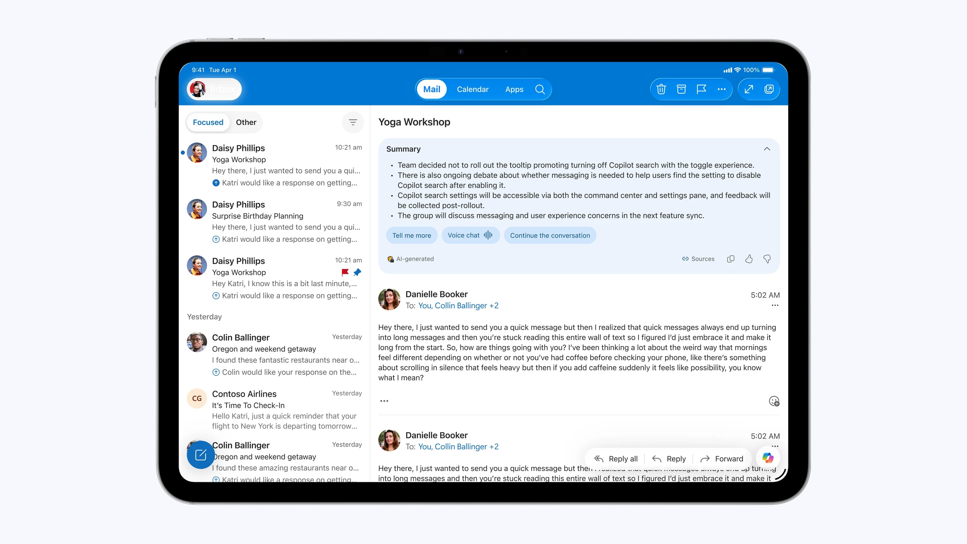
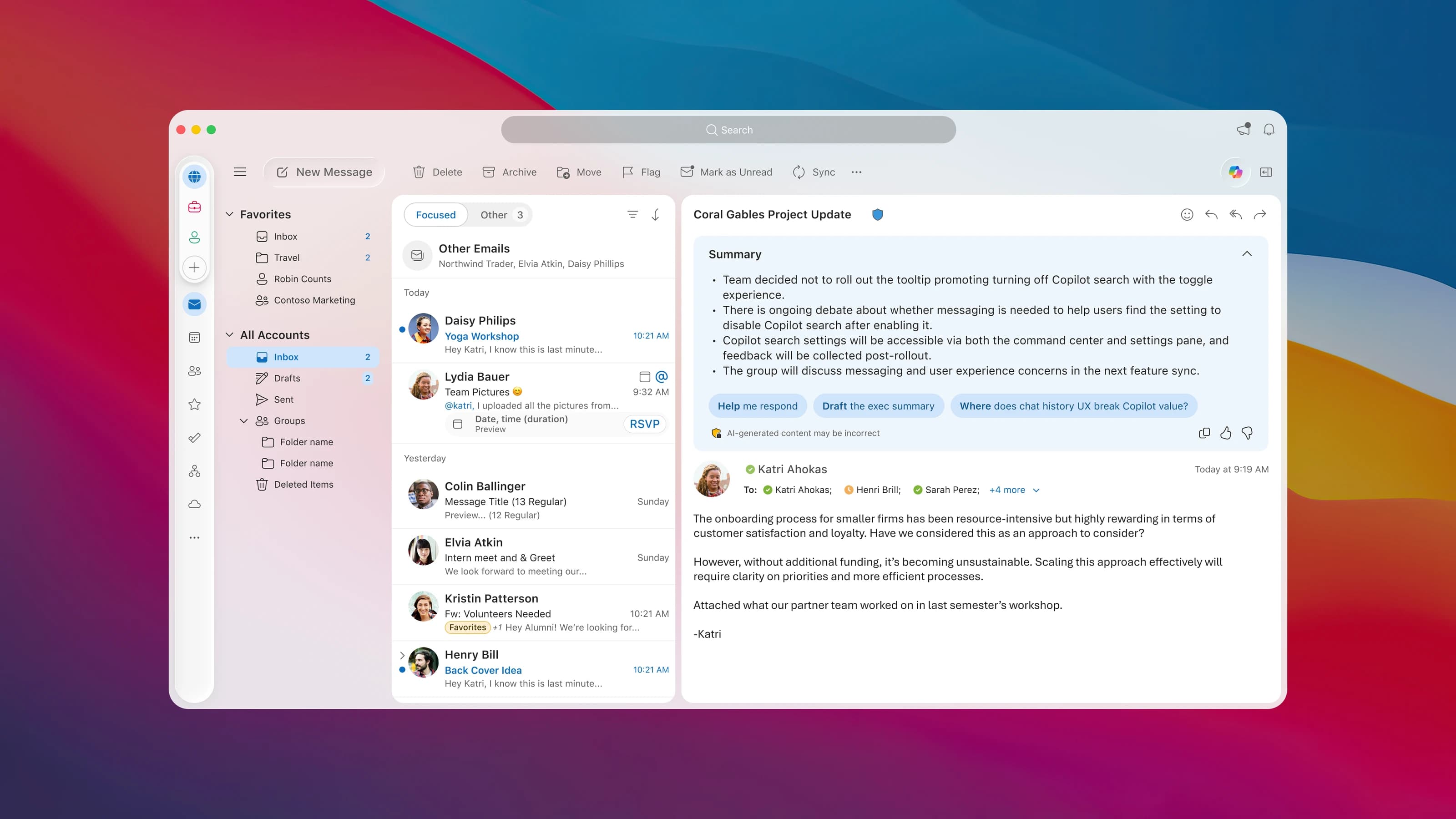
Before long, I was less the designer of Summarize and more a partner to other teams, helping them adapt and extend the pattern. The work soon reached beyond Outlook. The goal was never to make every experience look identical. It was a more coherent system for how AI shows up across Microsoft.